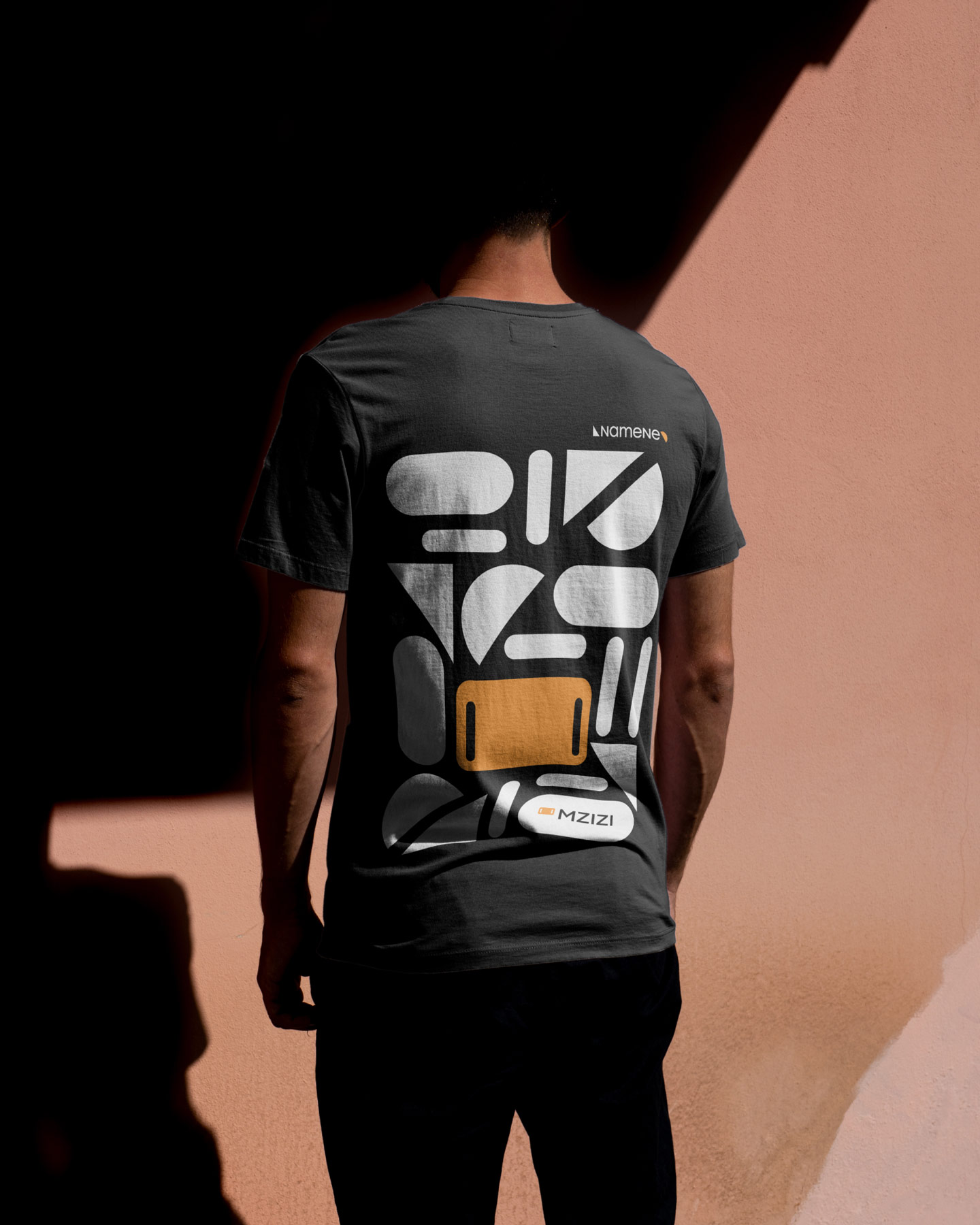
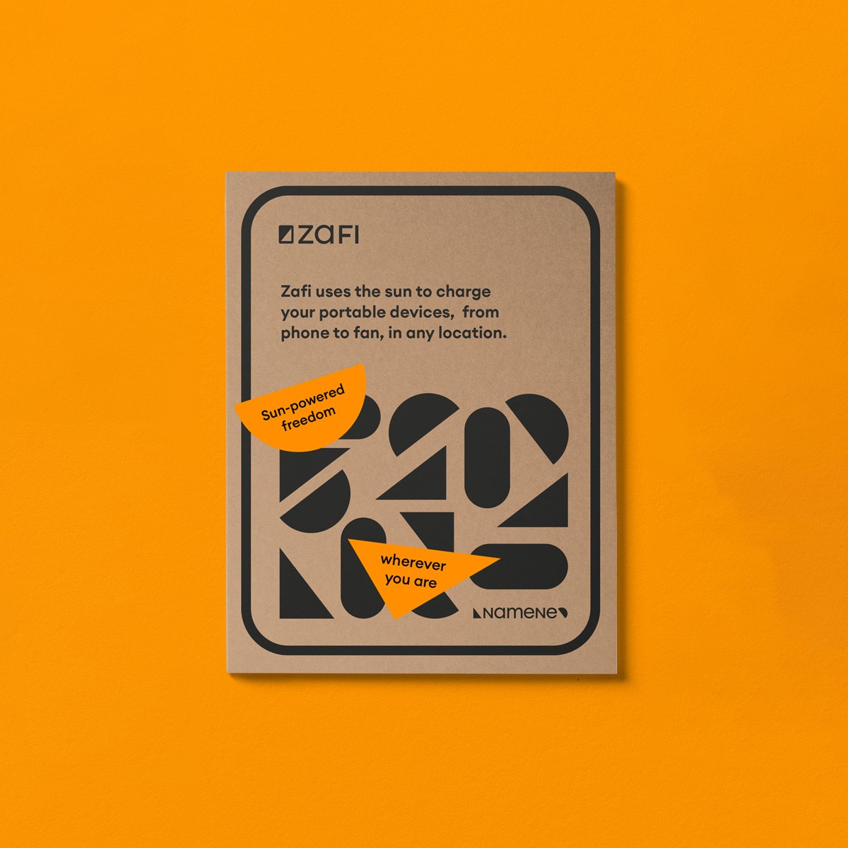
Namene Branding
As Namene evolved into a clean tech company, a brand redesign was needed to reflect its renewed purpose and ‘new dawn’ strategy. The new identity embodies this mission — empowering communities through clean technology. Semicircles and triangles symbolise a rising sun, evoking fresh beginnings and solar roots. Patterns inspired by product geometry express clarity, modularity, and versatility — mirroring the adaptability and joyful impact of Namene’s products. Cooperation with Jordan Burns.